Analysis Tutorial
This tutorial describes the basics of performing the analysis of data using SCelVis. For this tutorial, we will use the public demo instance at https://scelvis-demo.bihealth.org.
Note
Data to be visualized can either be uploaded into a SCelVis server or it can be defined when the SCelVis server starts. When using a remote SCelVis server such as the public instance at scelvis-demo.bihealth.org, you will most likely upload your data as shown below. However, the server can also be started with the path or URL to the data. This way, computational staff can provide predefined datasets to non-computational staff. See Command Line Tutorial for more information.
First, download the file pbmc.h5ad, which is a published dataset of ~14000 IFN-beta treated and control PBMCs from 8 donors (GSE96583; see Kang et al.). For a simpler dataset, you could also use hgmm_1k.h5ad, containing data for 1000 cells from a 1:1 Mixture of Fresh Frozen Human (HEK293T) and Mouse (NIH3T3) Cells (10X v3 chemistry).
Upload Data
Then, use the menu on the top right to access the data upload screen Go To –> Upload Data.
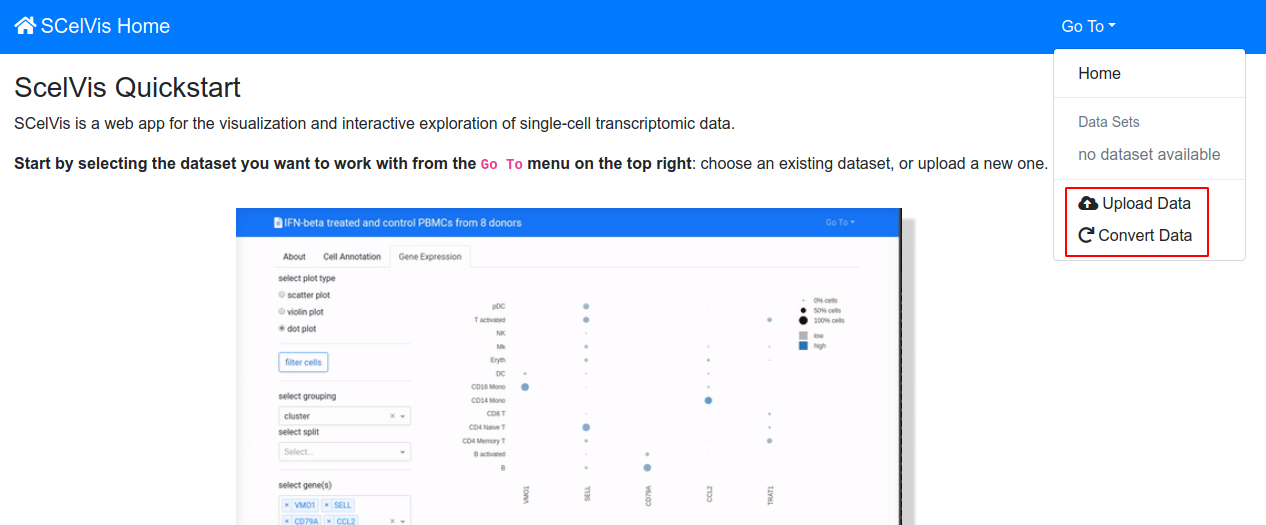
Accessing the upload screen.
On the next screen click Choose File, select the pbmc.h5ad file, and click Upload. The file upload will take a while and return a link to the data analysis screen shown in the next section.
Note
Alternatively, you can use the example data set available from the top-right menu: Go To –> Data Sets –> PBMC.
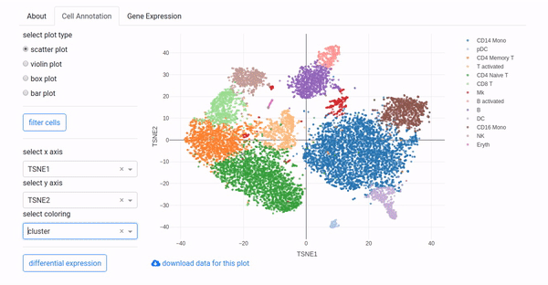
Cell Annotation Analysis
In the beginning of each analysis, the cell annotation screen from the figure below is shown.
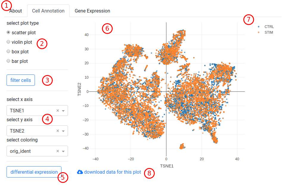
The cell annotation scatter plot.
Analysis selection tab. This control allows to switch between
- About
A textual description attached to the dataset.
- Cell Annotation
The cell annotation analysis screen that you are looking at.
- Gene Expression
The gene expression analysis screen.
Plot type selection. This allows to select the plot type for the cell-based analysis. Note that changing the plot type will change the subsequent controls.
Cell filter button. Using this control, you can filter cells based on various properties, see Section Cell Filtering.
Axis and color control. This allows you to select the dimensions to display along the horizontal and vertical axes as well as the colouring.
Differential expression button. This allows you to run a differential expression between two groups of cells, see Section Differential Expression Analysis.
The cell scatter plot. This is a dynamic scatter plot. Each dot corresponds to one cell, colored by what is selected from the select coloring list.
Plot controls. When you move your mouse cursor over the plot then some buttons will appear on the top right. These are explained in detail in Section Plot Interface Controls together with some other tricks.
Download data for this plot. Download a CSV file with the data for reproducing the plot outside of SCelVis.
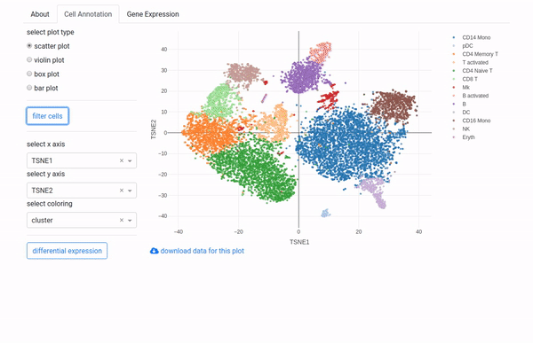
Scatter Plot
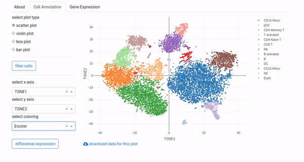
Usually, you would choose embedding coordinates (e.g., tSNE_1 and tSNE_2) for select x axis and select y axis to create a standard tSNE or UMAP plot. select coloring allows to color cells by different cell annotation attributes, e.g., cluster for the cluster annotation or n_counts for the # of UMIs per cell. The available choices depend on how the dataset was preprocessed. Categorical variables will be shown with a discrete color scale, numerical variables with a gradient.
Alternatively, you could also plot, e.g., # of UMIs vs. # of genes for QC.
Violin and Box Plot
When selecting violin plot or box plot in the select plot type control you can draw violin or box plots. For example, selecting n_counts and n_genes in the select variable(s) and :orig.ident in select coloring will display the n_genes value distribution in the upper panel, and the n_counts value distribution in the lower panel for the individual samples of this dataset.
You can use the select split list to select whether you want to further split the grouping, e.g., by cluster identity. Hovering the mouse over the violin or box shapes will show you various statistical summaries of the distribution.
Bar Plots
With bar plot, you can display summary statistics, such as the number of cells per cluster by selecting cluster in select grouping. With select split, you can further investigate how clusters are populated in the different samples or the different donors. Checking normalized will switch from cell numbers to fractions, stacked will use stacked bars.
Gene Expression Analysis
When clicking the Gene Expression tab, you can investigate gene expression. As for the Cell Annotation analysis, it starts with the scatter plot type in (1). The main difference is that all plot types will use the same list of genes selected in select gene(s) in (4).
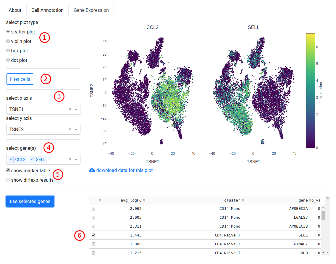
The gene expression scatter plot for a monocyte (CCL2) and a T cell marker (SELL).
- Plot type selection. This allows to select the plot type for the gene expression analysis. Note that changing the plot type will change the subsequent controls.
- Cell filter button. Using this control, you can filter cells based on various properties, see Section Cell Filtering.
- Axis control. This allows you to select the dimensions to display along the horizontal and vertical axes.
- Selecting genes. Select one or multiple genes from this list or enter them by hand.
- Show tables. Check these boxes to display tables with log2-fold change, p-values and other information for marker genes or differential expression results (if available).
- Table selection. Genes can be selected from the table by checking the boxes to the left and clicking use selected genes to add them to the list.
Scatter Plot
Scatter plots for one or multiple genes will be shown in a grid, with expression values rescaled to the same range.
Violin or Box Plot
Violin and Box plots will show one gene per row, with one violin or box per category selected in select grouping, or multiple violins/boxes if select split is used.
Dot Plot
Dot plots summarise gene expression by size (fraction of expressing cells) and color (expression value), with genes in columns and groups (use select grouping) in rows. Dots can be subdivided using select split.
Plot Interface Controls
A short demonstration of the plot controls in SCelVis.
The buttons on the top right of the plot (standard features of the Plotly library) are as follows:
- Save plot as image
- The plot will be saved in PNG format.
- Zoom
- After clicking this button, you can select a rectangular area to zoom into.
- Pan
- Drag and drop the drawing area to move around in the plot.
- Box Select, Lasso Select
- After clicking this button, you can select a rectangular area on the plot or draw a free from shape to select dots. This will be useful for differential expression analysis.
- Zoom In / Zoom Out
- Zoom into or out of plot.
- Autoscale / Reset Axes
- This will reset the scaling to the original area. You can obtain the same behaviour by double-clicking on a white spot in the plot.
- Toggle Spike Lines
- Enable horizontal and vertical lines when hovering over a point.
- Show Closest / Compare Data on Hover
- Change the spike lines behaviour.
Note that you can enable/disable individual groups by clicking their label in the legend. You can disable all but one group by double-clicking the label.
Cell Filtering
A short demonstration of cell filtering in SCelVis.
The cell filtering works as follows:
- Click the filter cells button to open the control panel.
- Select a criterion by which cells should be filtered. Depending on how the data were preprocessed, the list will include cluster annotation, # of UMIs or genes per cell, etc. It is also possible to filter cells by expression of genes.
- For categorical variables (e.g., cluster identity), checkboxes will appear and specific clusters can be (un)checked in order to include or exlude them from the analysis. For numerical variables (e.g., n_counts or gene expression), a range slider will appear: move the big circles inwards to remove cells outside the selected range.
- Hit update plot to apply these filters to the current plot
- Filters will be combined with AND logic; active filters are listed above the update plot button
- Click reset filters to reset all filters and update plot to include all cells in the current plot
- Note that current filter criteria will be applied to all subsequent plots of the current datasets, both in the Cell Annotation and the Gene Expression tabs
Differential Expression Analysis
A short demonstration of differential expression analysis in SCelVis.
The differential expression analysis is available only when a scatter plot is displayed in the Cell Annotation tab. It works as follows:
- Click the differential expression button, opening the controls panel.
- Then, use either the box or lasso select tool of the plot for selecting cells in the scatter plot. For example, click the lasso select button in the top of the right of the plot. Move your mouse cursor to the position you want to start selecting at. Keep the left mouse button pressed and draw a shape around the cells that you are interested in. Release the mouse button. then Click group A.
- Repeat step 2 but click group B.
- Click run to perform the analysis.
The result could read something like 200 DE genes at 5% FDR (a maximum of 200 genes will be displayed). You can click view groups to show the groups in the scatter plot, or click table to see the resulting DE genes in the Gene Expression tab table. You can also download the results or the parameters that were used for the DE gene analysis.
Clicking reset allows you to start a new DE gene analysis.
The End
This is the end of the data analysis tutorial. You might want to learn about the conversion of data into the HDF5 format next by reading Section Conversion Tutorial.